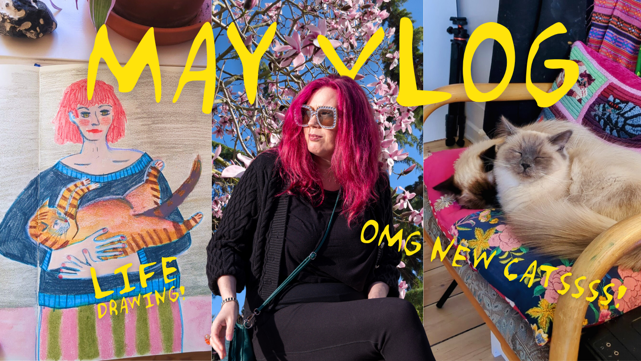
Mixing, swatching, and playing with a treasure trove of new art materials
Join me on a colourful journey through my latest art supply haul! From Liquitex acrylic markers to Neocolor II pastels, I'm buzzing with excitement. But the star of the show? The Gansai Tambi watercolour paints! Watch as I swatch, experiment, and create with these vibrant new tools.
-
Hi, my lovelies. I'm Eli Trier, and you're watching Zuzu's Haus of Cats, the show where I take you behind the scenes of my life as a professional artist. And today, I've got some packages… that I just hit myself in the face with. I've got some packages to share with you. I've had a bunch of art materials come in. I've got some stuff that I got for Christmas, and I'd like to try and go through. I've got some art supplies. We'll do a little bit of swatching (I love to swatch) and kind of talk you through stuff and show you what I'm doing. So let's get started.
Okay, the first thing we've got here is an order from Jackson's. Get rid of this. Of this. And this is a very exciting package. This is a new purchase for me, the Liquitex acrylic marker. I use Poscas quite a lot in my work, and I think I have, I can't remember, it's a Molotow or a Montana acrylic. I like acrylic markers generally, but I've never used the Liquitex ones. I've seen other people use them, Emma Carlisle, for example, and Sandi Hester. And there's something about the quality of the marks they make, especially as they start to kind of dry out, that really excites me. So I thought I would just pick one up and give it a go and see if I like it. Prussian blue is one of my favourite, favourite colours, so I got this and have a look at it.
Okay, this is what I'm really excited about, this. I think it's all Neocolor. Now, if you don't know about Neocolor, they are sort of wax pastel. They're basically like grown up crayons for art. And I bought a small set about a year ago, and I've just gradually been adding to it and adding to it and adding to it, and they've become possibly my favourite art material. So let's just move us out of the way so you can see things properly. So yeah, so they've become one of my absolute favourite art materials, and I've been gradually adding to it. And I think these are the final pieces that I don't have yet, so I've got a little handful of just colours that were missing from my collection, and that's it. I now have all the rest of them here. I now have the full set, which is kept very messily in this box, and they're the thing that I reach for probably most often.
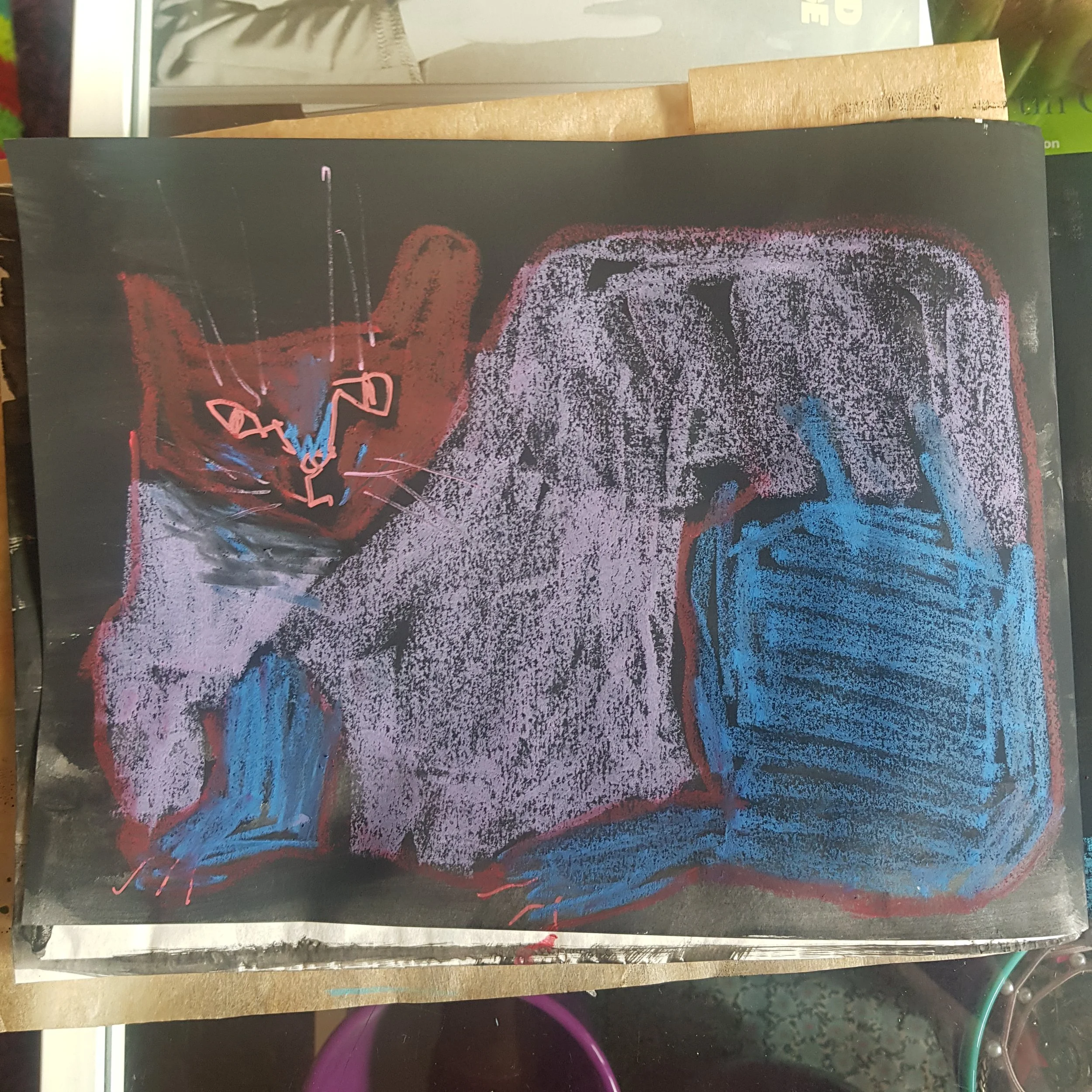
I use them in my final artwork for sketching out a design, you know, initially on a canvas. I use them for details on a canvas. I've got some examples here to show you. So they're great for, like, super quick, like, on the go sketches. They're really great just to, like, scribble down shapes. I use them or see here, I use them for texture in mixed media work. So they make these really lovely… This paper is slightly rough, and they make these really kind of lovely, rough textures up. So you can see a couple more examples here. I guess here painting just for the hair, just brings a new element into the work. And then I also do, like, whole pieces just in Neocolor II as well.
Let's bring this up a little bit. So this is acrylic gouache on the background, and then this is all Neocolor on the fish. They blend really nicely. They come in two sorts. So I like the Neocolor twos because they're water soluble. You can also get Neocolor ones. And I think they're a bit less Jammy, like these just go down like crayons. They're lovely. And the Neocolor ones are a little bit stiffer, I suppose, on the page. Oh yeah, this is just another one, this is a whole piece just done in Neocolor. So you can see they're really, really sort of jammy. Jammy textures, like really good oil pastels, but less sticky and claggy. So I like doing it for that.
Also, what I like them for is working on coloured paper. Here I have this huge sketchbook with black paper. You can see how that the Neocolor works kind of on the black and you get these lovely, vibrant colours that shine through. Yeah. So if you haven't tried them, I highly recommend them. They are, like I said, my most reached for especially when I'm sketching or I just want to capture something super quickly. Neocolor is the loveliest of course, they're water soluble as well, so you can do a really quick sketch. Etch just while you're out and about, and then you can come home and you can use a water brush or something and turn it into a watercolour thing, which is lovely. It looks just like watercolour. So that's those.
I also talk about coloured paper. I got this pad of paper for Christmas from my husband, who knows that I love using the new colours on coloured paper. And so this is five colours. It's just an A four mix, 160 grams, so it's nice and thick. I'm looking forward to doing some stuff with the Neocolor on that.
What else have we got? Okay, next thing is these. I'm so excited about these. I've seen so many people using these, and I was incredibly resistant to start with. It's like, I have enough paint. I use acrylic, I use watercolour, I use gouache, I use acrylic gouache, like I don't need any more paint. But I saw so many people using these and swatching them, and all the different colours and the way that people were talking about them, they're kind of watercolour, gouache hybrid, as far as I can make out. So they've got lovely, thick, Jammy, opaque colours, but they're also, you can get a really good transparency with them, and they work a bit like watercolour as well. So you can kind of, I don't know, they're a hybrid. They're kind of both. So I'm really, really excited to break these out and get swatching. The colours are just gorgeous.
And see all the information there. This is the 140 No, sorry, 48 colour set, which has got such a good range. And I especially like that they have a number of different golds, because as far as I'm concerned, you can never have too much gold. So we're starting, oh, they're kind of sticky. Oh, that's beautiful. We've used quite a lot of water there, so it's quite transparent, but it looks like you can build the colour up quite nicely. That's gorgeous. What's that? Rose Madder deep. So is Carmine, a very similar colour. They're really lovely. They go down on the page beautifully. What's this? This is just Rose Madder, Pinky, Pinky. What's this? Red? Oh, that's a nice red. Very Pinky. This is Cadmium Red, oh, that's more orangey. Oh, that's a nice red. Oh, I like these. I like these a lot.
We are here. Oh, yes. Oh, these are gorgeous. So that one that I just put down was cadmium Scarlet, and this is Cadmium Orange. Rattly little buggers. Oh, that's a nice orange. And then this is a cad yellow. This slide is called Oreo Lin. I don't know what that means. It's a pretty colour, though. Oh, look at that. Cad Yellow is so pure, pure yellow. Got this one, which is a lemon yellow. Oh, Punchy. Nice and cool. Very bright. This is a greenish yellow. That's nice. Is this interesting. I don't know if this is interesting. I do like to swatch. Oh, that's nice. What's that? Olive Green? Yes, like an olive green. Then what have we got? Lime Green? Whoa. Yes, it is. It's some Limington greensicles. Pow. Also very good Barcelona parakeet colour. This is sap green light that's very bright. I'm looking forward to mixing with these, knocking them back a bit, because these are super intense. And this is just sap green. Oh, that's nice. And then good old hookers green. More sap green. This is Sap Green, deep. forest green. Oh, look at that. That's gorgeous.
I mean, they are quite transparent. They're maybe a bit too wet for this paper. I'm using quite a lot of water here, though. I'm not being very judicious. This is green, deep. Oh, that's a good colour. Oh, I love that colour. And tell you what they remind me of. I've got a little kind of kiddie set of like Koh, I Noor kids watercolour paint, and they're not light fast at all, but the colours are just so punchy and vibrant. I use them quite a lot in my sketchbook, because they're just joyful. So that's a very green, green. What's this? Viridian? Mm, not a very, it's not a very exciting, brilliant. This is Malachite. Colours are so intense. They are beautiful. They're really kind of clear and vibrant. But I really do. I'm looking forward to mixing them up and knocking them back.
Horizon blue, rot blues, people, oh, it's a nice, nice sky blue, nice and subtle. Use that really transparent as a lovely kind of sky colour. And this is Ultramarine pale, which is that beautiful kind of periwinkle colour again. Oh, it's just stunning. Making a mess over here, stunning. And then this is turquoise blue. Oh, that's another beautiful colour. It's a proper, proper turquoise, gorgeous, lovely, with a bit of raw umber in it.
So I've moved around a little, and I've changed brushes, cerulean blue, and then cobalt blue. And an ultramarine blue. These are all, Oh, it's a bit deeper. It does make a difference. Doing this on the cream paper, I have to say, I also did a swatch card on the white paper as well, so you can have a look at what that looks like. Oh, that's nice. That's that prussian blue. Yeah, the king of blues. Oh, so good. Oh, this is Indigo. Oh, that's rich. I like that. I like that a lot. This is blue, grey, deep, so like a Payne's grey. That's lovely, too. Oh yeah, these are great colours. They've got a real they've got real purity to them. Oh. Oh, yeah. How can you hate a colour like that? Look how beautiful that is.
This is Imperial violet, actually. Interestingly enough, I've switched to using just an ordinary square brush rather than the water brush, and I'm getting much more capacity. They're going down much thicker and more opaque. Look at the vibrancy of that Holy mackerel. It's that cobalt, Violet, beautiful. This is purple. It's a really lovely red purple. I don't know how much they love this paper, but I think if you're just doing sketchbook stuff and doing washes and things, then I don't think it matters too much. I tend to have several sketchbooks on the go, like all with different papers. So I just have a mix and match my materials, depending on what I'm using and what I like to use best on each different paper.
That's a lovely lilac. This is cherry blossom pink. And if I was going to do cherry blossoms, this is exactly the pink I would use, quite a kind of sickly, sickly bubblegum pink. But it's got, it's got some depth to it, which is nice. They're not completely flat here. There's some really interesting kinds of neutral colours here. So this is Rose beige. My water's getting a bit dirty. That's nice. A bit darker than the royal talons paper. Brilliant for doing life drawing, lovely Pinky beige. And then here we have more of a yellowy, yellowy beige, which I think is almost exactly the colour of the Royal talents paper. That's amazing, perfect. But if you want to just block something out, like, very, very, very lightly before you go in and do more, there's a gorgeous Yellow Ochre.
Here we have nice, Oh, lovely burnt sienna. I really like these paints. I'm looking forward to doing some mixes with them, and I'm looking forward to actually making a drawing with them. But they're really nice to use, and I prefer them with just the ordinary brush, but rather than the water brush, you can see the difference this is going down. Oh, look at that colour. What's that Maroon? Oh, that's beautiful. These three together are really bringing me joy. Indian red. Oh, yes. Oh, that's lovely. Oh, I am so excited by these colours. There's just this crystal, crystal clarity to them, which is really beautiful.
It's one of my favourites, Raw Umber. I mix this with so much. It just really works to knock back anything that's too intense. I'll do some colour mixing with these later, and I'll show you what I mean. But yeah, beautiful, beautiful, rich tone. Got black. That's a nice black, nice. Oh, these are lovely. I'm so glad I was only gonna get a tiny little set just to try them out. And I mentioned it to last and for Christmas, he got me this 48 is it? 48 set? It's grey. It's a nice, cool grey. Let's prefer warm grey, I have to say, on the whole but that's so nice grey, and then we have white, which is probably not going to show up at all on camera, just about see it with my eyeballs. That's nice, dirty water. So again, you're not getting pure white.
And then we have the golds. Oh, my goodness. Look at this. This is white gold, which is very unimpressive on this coloured paper. It's definitely got a kind of silver, warm silver sheen to it. You can kind of see it sheening In the light bluish gold, which, again, I think, is going to suffer for being on this coloured paper. It's pretty good. Not too shabby. There's one more gold, and then I'll show you. Show you the shimmer. Show me the shimmer. And then this is just, this is just gold, no qualifiers, just gold. It's actually, I don't know. I feel like it's a bit more, maybe bronzy, let's say this is more of a true gold. It's nice, though, and he doesn't love a little bit of shimmer. There you go. If you can see, whoo, sorry, that's the chair. You see a little bit of shimmer and shine there.
So, yes, those are the Gansai paints, and if you want to see them on, this is on the royal talons paper, which is cream. This is what they look like on just plain white paper. This is the swatch card that comes in the box. So if you pause the screen, then you can see the colours and the names. I think you can buy most of these pans individually so there's a particular colour that really captures your attention, then the numbers will be on here too.
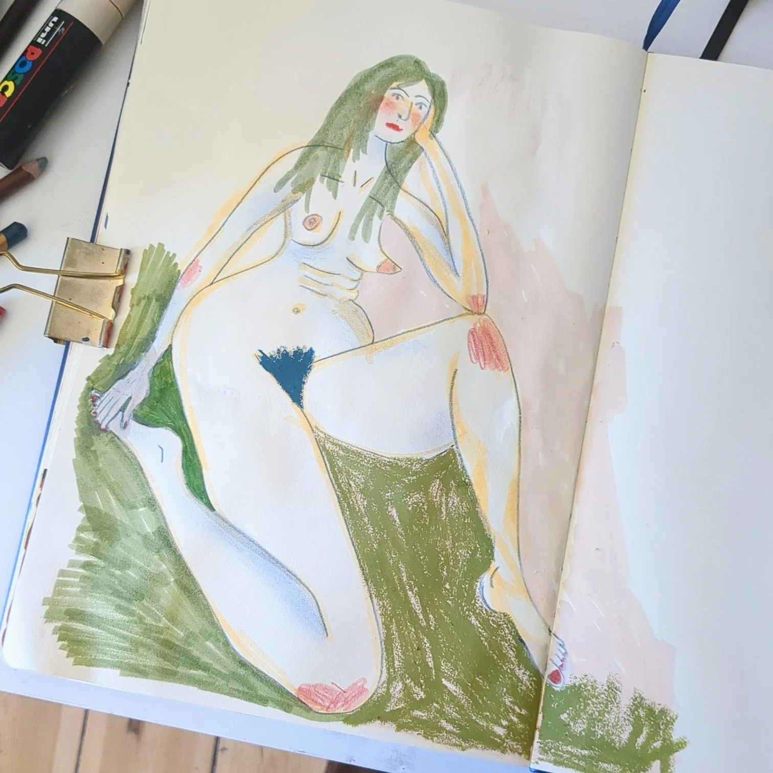
Okay, so I thought I had a bit of a play with the Gansai paints and coloured paper and all these bits and bobs that we've got. And I thought I'd show you what I did before we kind of wrap this up and give you, kind of my final conclusion on the gansite paint. First of all, I did these drawings on the coloured paper. And of course, they're cats. I mean, I can't not draw cats. I'll put the camera overhead so you can have a look. We have a yellow one. I think this one is my favourite. You might have seen that one on Instagram. This one, this one. I love this one too. Then we have an orange one, and this one is Lar’s favourite. He really likes the giant ear.
So, yeah, I mean, I knew I would love this paper. I love using the Neocolor on the black paper. And this is no different. It's just absolutely, it's a joy to use. And I love how the Neocolor shows up on the paper. So then I started playing around with the Gansai paints a little bit more. You saw me do, um, just these colour swatches and on the white paper as well. After I'd done that off camera, I just was playing around with different mixes. So this is just using the gansai paints and just with no particular methodology or anything, just messing around, seeing what combinations I could get. Just yeah, one colour after another, messing about. And you can see I've got a really lovely range of kind of quite transparent in a lot of cases, but really nice neutral colours. And this, again, this is on the Royal Talens Art Creations sketchbook, which has this kind of creamy paper. After doing that, I wanted to actually make some drawings with them, make a painting with them, but I don't really like them on this paper, to be honest. So I decided to go into my… What's this? … my Fabriano sketchbook, which has white paper, sort of thick, a bit textured, and I made these fishes. I just had this sketchbook open just to copy the shapes, just for reference. And, yeah, you can see they've come out really beautifully vibrant.
The colours are lovely. The paint behaves really well. It's like, I mean, I know this sounds dumb, but it's like a thick, opaque watercolour, so not quite as thick and jammy as gouache out of a tube, but you can still get quite a lot of opacity out of it. I really like how it behaves on this paper. It really is like you get the looseness and the dribbliness of watercolour, but you still get that kind of opacity and vibrancy of gouache. So I'm calling that a very good purchase. I'm really happy with them, and I'm sure I'll be using them a lot in my sketchbook.
So that's it for this week's video. I hope you've enjoyed it. I hope it's inspired you to maybe play with some more materials, try some new things, and yeah, I will be back next week, and I will see you there. Don't forget to subscribe. Bye.